
|
Getting your Trinity Audio player ready... |
Introduction
In today’s digital world, having a mobile-friendly website isn’t just a luxury; it’s a necessity. More than half of all web traffic comes from mobile devices, so if your website isn’t optimized for mobile users, you’re missing out on a massive audience. Designing a mobile-friendly website involves more than just making it look good on a smaller screen. It’s about creating an enjoyable, efficient, and seamless experience for your users, no matter what device they’re using. Let’s dive into the five essential steps to design a mobile-friendly website that keeps your audience engaged and coming back for more.
Step 1: Understand Your Audience
Research User Behavior
Before you start designing, you need to understand who your audience is and how they use their mobile devices. Look at your website analytics to see what devices people are using to access your site. This data can give you valuable insights into user behavior and preferences.
Identify Device Preferences
Knowing the types of devices your audience uses helps you tailor your design to fit their needs. Are they primarily using smartphones or tablets? What operating systems are they on? Answering these questions will help you create a design that works well on the devices your audience prefers.
Create User Personas
Creating user personas can help you visualize your audience’s needs and preferences. These personas represent different segments of your audience and guide your design decisions. Consider factors like age, occupation, and tech-savviness when developing these personas.
Step 2: Optimize Website Layout and Design
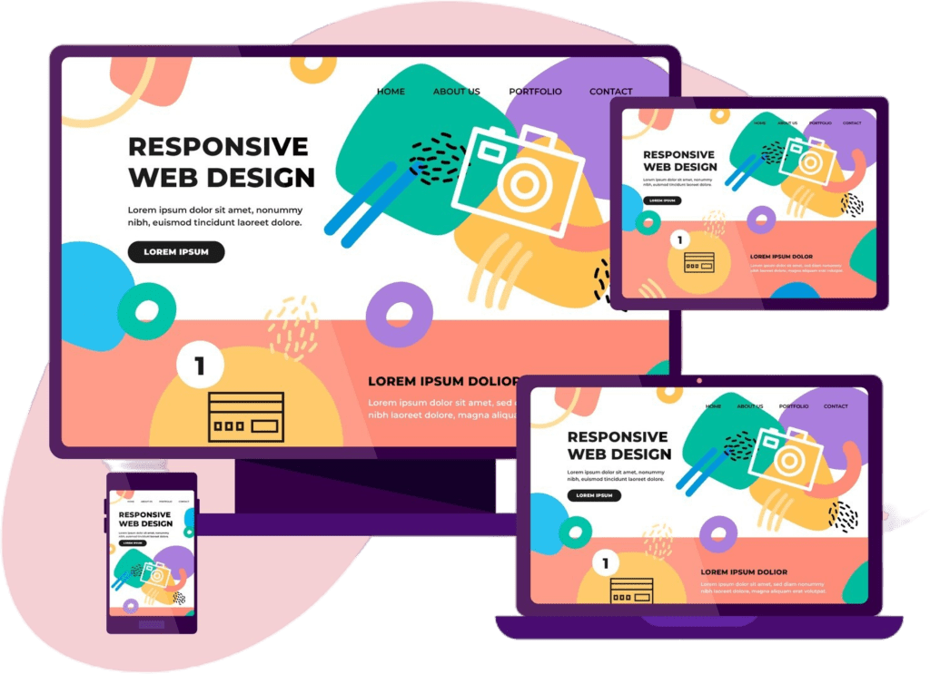
Responsive Design Principles
A responsive design ensures that your website adapts to any screen size. Use flexible grids, layouts, and images that adjust smoothly as the screen size changes. This approach ensures a consistent user experience across all devices.
Grid-Based Layouts
Grid-based layouts help organize your content in a way that’s easy to navigate on smaller screens. Using a grid system can make your design more flexible and scalable, ensuring that your website looks great on any device.
Scalable Images and Fonts
Ensure your images and fonts scale properly on different screen sizes. Use vector graphics for images and set font sizes in relative units like percentages or ems, so they resize smoothly across devices.
Step 3: Improve Site Speed and Performance
Compress Images and Files
Large files can slow down your website, especially on mobile devices with slower internet connections. Compress your images and files to reduce load times without compromising quality.
Minimize HTTP Requests
Every element on your web page requires an HTTP request, which can slow down your site. Minimize these requests by combining files and removing unnecessary elements.
Use a Content Delivery Network (CDN)
A CDN stores your website’s data on multiple servers around the world, reducing the distance between your site and the user. This can significantly improve load times for users across different geographic locations.
Step 4: Enhance User Experience (UX)
Simplify Navigation
Keep your navigation simple and intuitive. Use a hamburger menu to save space and make it easier for users to find what they’re looking for without overwhelming them with options.
Implement Touch-Friendly Elements
Design your website with touchscreens in mind. Make buttons and links large enough to be easily tapped, and avoid using hover effects that don’t translate well to touchscreens.
Prioritize Readability
Ensure your text is readable on smaller screens by using a legible font size and sufficient contrast between the text and background. Break up long paragraphs into shorter, more digestible chunks.
Step 5: Test and Iterate
Perform Mobile Usability Testing
Regularly test your website on various mobile devices to ensure it works as intended. Use both real devices and emulators to get a comprehensive understanding of your site’s performance.
Analyze User Feedback
Pay attention to feedback from your users about their mobile experience. Use this feedback to make necessary adjustments and improvements.
Regularly Update and Optimize
The digital landscape is constantly evolving, and so should your website. Regularly update and optimize your site to ensure it remains mobile-friendly and performs well.
Conclusion
Designing a mobile-friendly website is essential for reaching and retaining a broad audience. By understanding your audience, optimizing your layout and design, improving site speed and performance, enhancing user experience, and continuously testing and iterating, you can create a website that offers a seamless and enjoyable experience on any device. Keep these steps in mind, and you’ll be well on your way to mobile-friendly success. For expert assistance, consider consulting with BitSync’s website development services to ensure your website is optimized for all users.